VISUAL CREDIBILITY
A core pillar of a highly effective websiteWhen your website’s visual presentation looks off, it can make potential clients subtly (or blatantly) underestimate your credibility and hesitate before making an inquiry.
EVEN when your results are top-notch. And especially when your clients really care about aesthetics–whether they’re aware of it or not.
If your website is missing parts of this core website pillar, it can show up in several ways.
➺ The visual aspects aren’t working together cohesively
When the visual elements on your website tell conflicting stories, your visitors may feel the disconnect, even if they can’t explain why.
This could happen because your visual elements (like colors, fonts, images, and layout), aren’t communicating the same message. Here are some examples how this can play out:
The photos on your website feel corporate, while the branding feels soft and playful
The fonts feel childish when your work is very high-level and strategic
Too many colors or large blocks of text may make the website feel chaotic, even though your actual work is calm and intentional
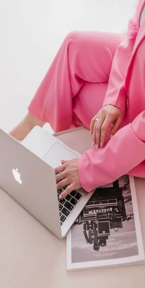
➺ Your images undervalue your expertise
If the photos on your website aren’t representing how you show up for your clients, consider if:
Your photos are blurry or out of proportion
You’re only using stock/generic images vs. pictures that capture YOU and your energy and how it’s like to work with you
The photos are decent, but they don’t match the tone of your fonts, colors, and messaging (the lighting, your outfit, the poses, etc. can influence this)
➺ It looks like everyone else
Does your website visually look like every other coach in your industry? If yes, consider if it’s because:
Your website is AI-generated or a generic template (if you believe you have gaps in the visibility credibility pillar, consider how using AI may be playing a role)
You don’t have your own distinct branding (logo, colors, fonts, image style, patterns, etc)
Your not putting enough of your personality (as it relates to your work) and what makes you unique in the visuals
one ACTION STEP
My favorite way to improve a website visually is to get a professional photoshoot. This will do wonders for your website!
If it’s been a few years or your pictures are not doing you justice, your action step is to book a photoshoot with a brand (or wedding*!) photographer today!
*Wedding photographers are very good at getting in-action and portrait shots—just like a brand photographer.

Looking for a more in-depth assessment of your website?
Book a Brand and Website Compass call. It’s designed to give you clarity and a strategic path forward to building a website that attracts your ideal clients.
There are 3 more core pillars of a highly effective website.
Curious what theY are? Check them out below.